Tom Adamczewski, 2024
The Expert Survey on Progress in AI (ESPAI) is a large survey of AI researchers about the future of AI, conducted in 2016, 2022, and 2023. One main focus of the survey is the timing of progress in AI.1
The timing-related results of the survey are usually presented as a cumulative distribution function (CDF) showing probabilities as a function of years, in the aggregated opinion of respondents. Respondents gave triples of (year, probability) pairs for various AI milestones. Starting from these responses, two key steps of processing are required to obtain such a CDF:
- Fitting a continuous probability distribution to each response
- Aggregating these distributions
These two steps require a number of judgement calls. In addition, summarising and presenting the results involves many other implicit choices.
In this report, I investigate these choices and their impact on the results of the survey (for the 2023 iteration). I provide recommendations for how the survey results should be analysed and presented in the future.
This plot represents a summary of my best guesses as to how the ESPAI data should be analysed and presented.
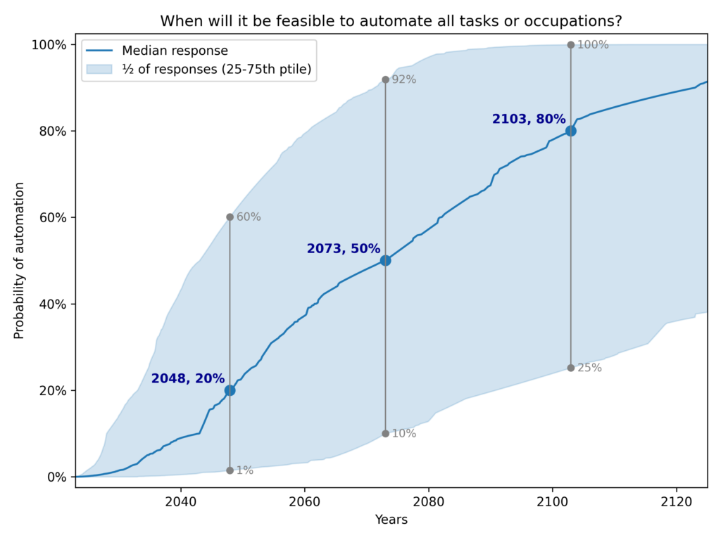
See the version in the paper
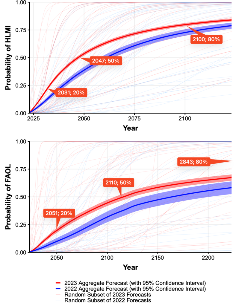
Thousands of AI Authors on the Future of AI, Figure 3. I added annotations to the 20%, 50%, and 80% points, for comparison with my plot.
I differ from previous authors in four main ways:
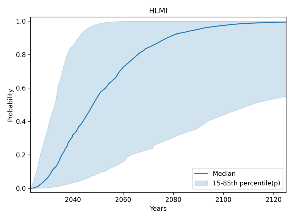
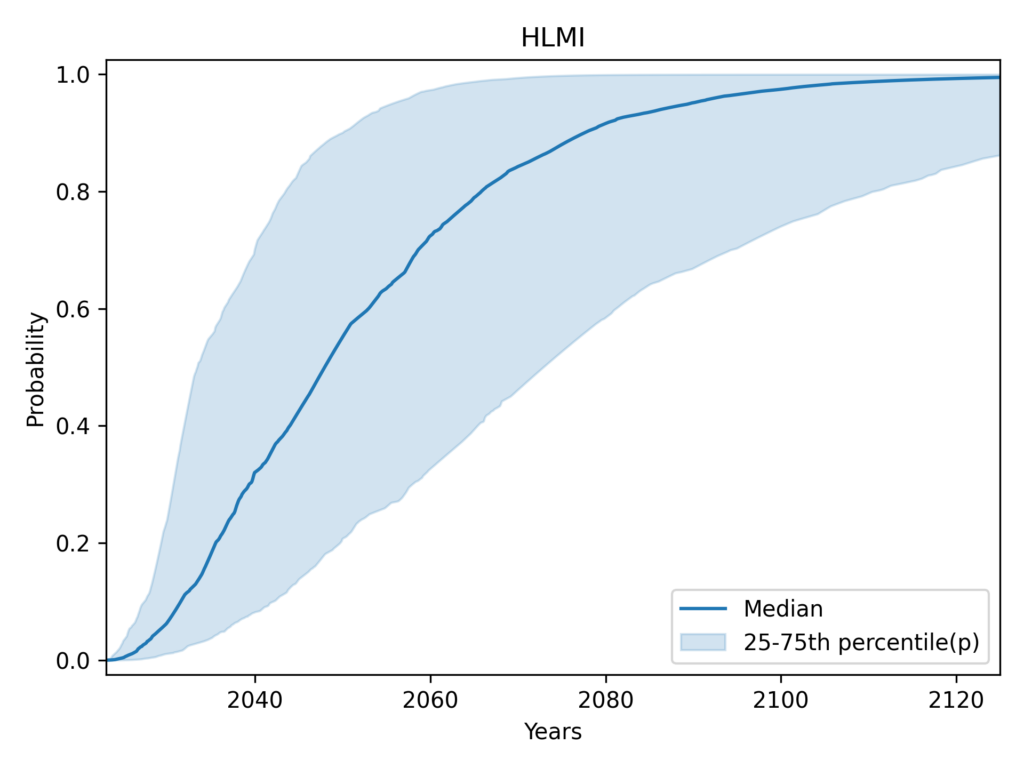
- Show distribution of responses. Previous summary plots showed a random subset of responses, rather than quantifying the range of opinion among experts. I show a shaded area representing the central 50% of individual-level CDFs (25th to 75th percentile). More
- Aggregate task and occupation questions. Previous analyses only showed task (HLMI) and occupation (FAOL) results separately, whereas I provide a single estimate combining both. By not providing a single headline result, previous approaches made summarization more difficult, and left room for selective interpretations. I find evidence that task automation (HLMI) numbers have been far more widely reported than occupation automation (FAOL). More
- Median aggregation. I’m quite uncertain as to which method is most appropriate in this context for aggregating the individual distributions into a single distribution. The arithmetic mean of probabilities, used by previous authors, is a reasonable option. I choose the median merely because it has the convenient property that we get the same result whether we take the median in the vertical direction (probabilities) or the horizontal (years). More
- Flexible distributions: I fit individual-level CDF data to “flexible” interpolation-based distributions that can match the input data exactly. The original authors use the Gamma distribution. This change (and distribution fitting in general) makes only a small difference to the aggregate results. More
See effects of changes, compared to the results in the paper
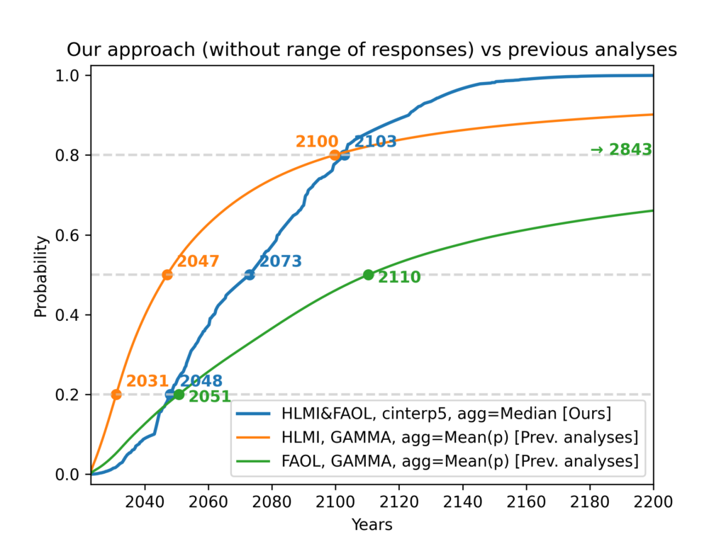
The combined effect of (3 of the 4 elements of) our approach, compared with previous results. For legibility, this does not show the range of responses, although I consider this one of the most important innovations over previous analyses.
| CDF | Framing of automation | Distribution family | Loss function | Aggregation | p20 | p50 | p80 |
| Blue (ours) | Aggregate of tasks (HLMI) and occupations (FAOL) | Flexible | Not applicable | Median | 2048 | 2073 | 2103 |
| Orange (previous) | Tasks (HLMI) | Gamma | MSE of probabilities | Arithmetic mean of probabilities | 2031 | 2047 | 2110 |
| Green (previous) | Occupations (FAOL) | Gamma | MSE of probabilities | Arithmetic mean of probabilities | 2051 | 2110 | 2843 |
Note: Although previous authors give equal prominence to the orange (tasks, HLMI) and green (occupations, FAOL) results, I find evidence that the orange (tasks, HLMI) curve has been far more widely reported (More).
The last two points (aggregation and distribution fitting) directly affect the numerical results. The first two are about how the headline result of the survey should be conceived of and communicated.
These four choices vary in both their impact, and in my confidence that they represent an improvement over previous analyses. The two tables below summarise my views on the topic.
| Choice | Impact on understanding and communication of main results | Confidence it’s an improvement |
|---|---|---|
| Show range of responses (More) | High | Very high |
| Aggregate FAOL and HLMI (More) | High | Moderate |
| Choice | Numerical impact on aggregate CDF | Confidence it’s an improvement |
|---|---|---|
| Median aggregation (More) | High | Very low |
| Flexible distributions (More) | Minimal | High |
Even if you disagree with these choices, you can still benefit from my work! The code used to implement these new variations is open source. It provides user-friendly configuration objects that make it easy to run your own analysis and produce your own plots. The source data is included in version control. AI Impacts plans to use this code when analysing future iterations of ESPAI. I also welcome engagement from the wider research community.
Suggested textual description
If you need a textual description of the results in the plot, I would recommend:
Experts were asked when it will be feasible to automate all tasks or occupations. The median expert thinks this is 20% likely by 2048, and 80% likely by 2103. There was substantial disagreement among experts. For automation by 2048, the middle half of experts assigned it a probability between 1% and a 60% (meaning ¼ assigned it a chance lower than 1%, and ¼ gave a chance higher than 60%). For automation by 2103, the central half of experts forecasts ranged from a 25% chance to a 100% chance.2
This description still contains big simplifications (e.g. using “the median expert thinks” even though no expert directly answered questions about 2048 or 2103). However, it communicates both:
- The uncertainty represented by the aggregated CDF (using the 60% belief interval from 20% to 80%)
- The range of disagreement among experts (using the central 50% of responses)
In some cases, this may be too much information. I recommend if at all possible that the results should not be reduced to the single number of the year by which experts expect a 50% chance of advanced AI. Instead, emphasise that we have a probability distribution over years by giving two points on the distribution. So if a very concise summary is required, you could use:
Surveyed experts think it’s unlikely (20%) it will become feasible to automate all tasks or occupations by 2048, but it probably will (80%) by 2103.
If even greater simplicity is required, I would urge something like the following, over just using the median year:
AI experts think full automation is most likely to become feasible between 2048 and 2103.
The distribution of raw responses
Even readers who are familiar with ESPAI may only have seen the results after processing. It can be helpful to look at the raw data, i.e. respondent’s answers to questions before any processing, to remind ourselves how the survey was conducted.
All questions about how soon a milestone would be reached were framed in two ways: fixed-years and fixed-probabilities. Half of respondents were asked to estimate the probability that a milestone would be reached by a given year (“fixed-years framing”), while the other half were asked to estimate the year by which the milestone would be feasible with a given probability (“fixed-probabilities framing”).
Example: Retail Salesperson occupation
Responses about one such milestone (say, the occupation of retail salesperson in the example below), if shown as a scatterplot, form three horizontal lines for fixed probabilities, and three vertical lines for fixed years. These correspond to the six questions being asked about the milestone:
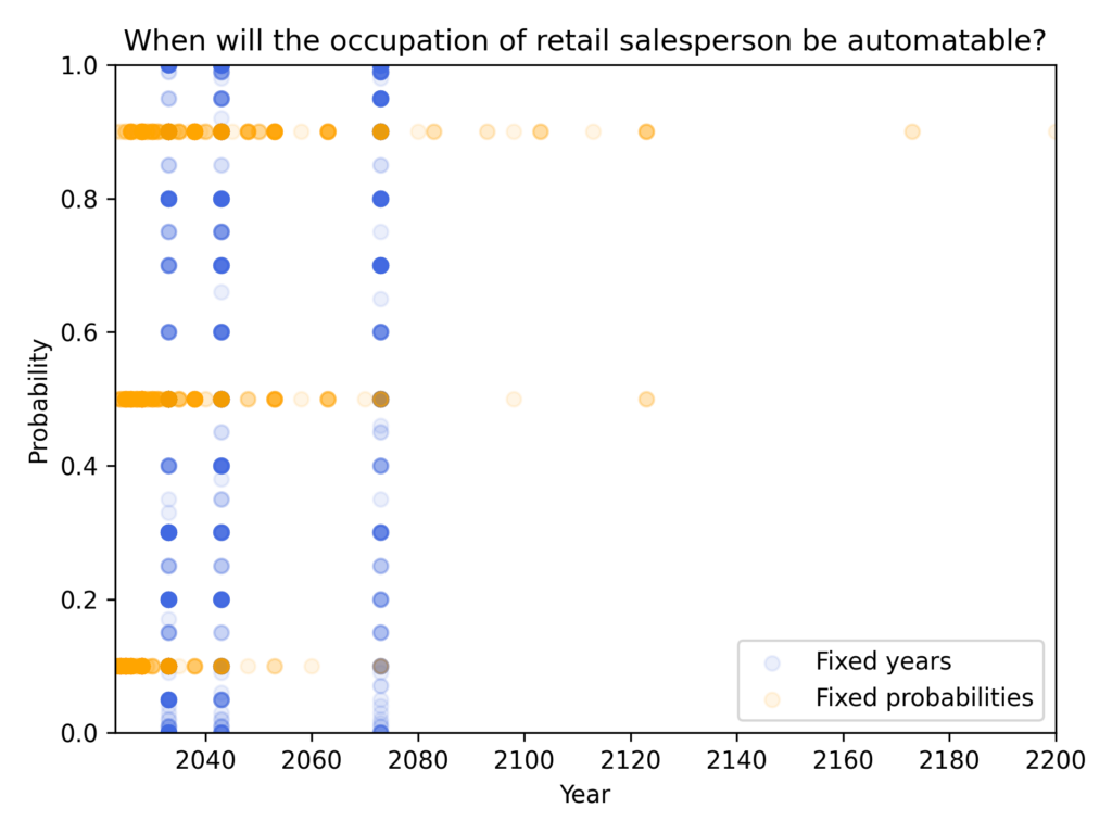
The scatterplot is a helpful reminder of the data’s shape in its rawest form. However, all scatterplots will form three horizontal and three vertical lines. We can show more structured information about the distribution of responses for each of the six questions by using six box and whisker plots3, as shown below:
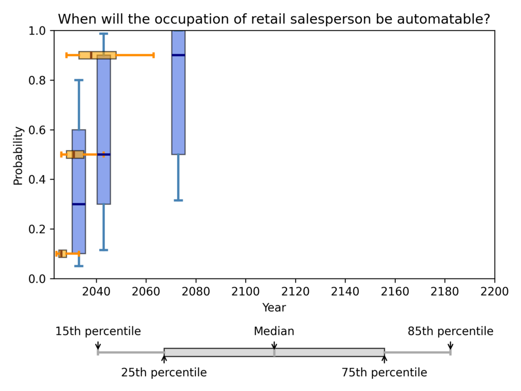
We can see several useful things in this set of box plots:
- There is a large framing effect, whereby the fixed-years framing produces later predictions. (This effect is familiar from previous analyses of ESPAI, where it has been shown to occur systematically).
- For example, the prediction (2043, 50%) is the 85th percentile of responses for the 50% question in the fixed-probabilities framing, while the same prediction is the median response for the 2043 question in the fixed-years framing.
- When asked about 2073 in the fixed-years framing, the median response was 90%, which is much later than even the 85th percentile response to the 90% question int the fixed-probabilities framing.
- Responses follow a skewed distribution
- For all three questions in the fixed-probabilities framing, the responses have a large right skew
- In the fixed-years framing, the 2033 question produces a right skew (up skew in the boxplot), whereas the 2073 question produces a left-skew (down skew in the boxplot), with more than 25% of respondents giving a probability of 100%.
- There is a wide range of responses, indicating substantial disagreement among respondents. For example, when asked about 2043, the interval (centred on the median) that contains half of responses ranged from a 30% chance to a 90% chance. The interval that contains 70% of responses ranged from a 10% chance to a 98% chance.
We can now look at the distribution of raw responses for the timing of human-level performance.
Timing of human-level performance
When the survey investigated the timing of human-level performance, the question was framed in two ways, as tasks, and as occupations4:
- “High-Level Machine Intelligence” (HLMI): when unaided machines can accomplish every task better and more cheaply than human workers.
- “Full Automation of Labor” (FAOL): when for any occupation, machines could be built to carry it out better and more cheaply than human workers.
We can now take each of these in turn (expand the collapsible sections below).
Full Automation of Labor (FAOL)
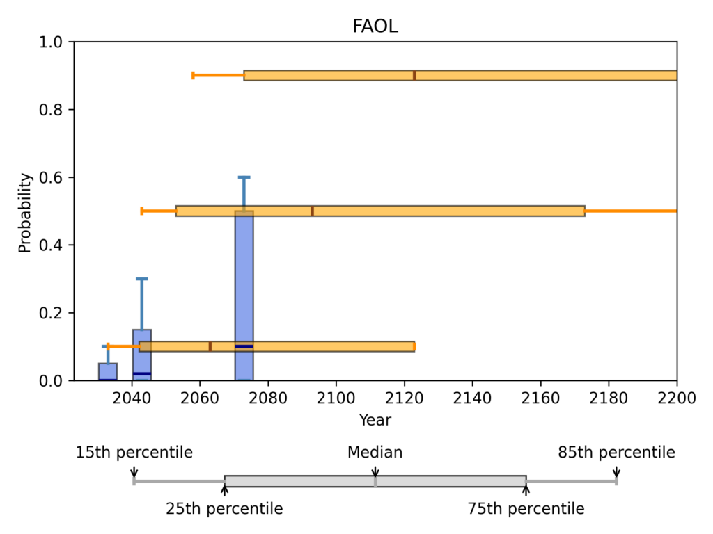
In the fixed probabilities framing, respondents were asked for the number of years until a 10%, 50%, and 90% probability of FAOL:
| Probability of FAOL | Mean response | 15th percentile response | Median response | 85th percentile response |
| 10% | 5.08e+05 | 10 | 40 | 100 |
| 50% | 7.84e+05 | 20 | 70 | 200 |
| 90% | 1.01e+06 | 35 | 100 | 500 |
In the fixed years framing, respondents were asked for the probability of FAOL within 10, 20, and 50 years:
| Years until FAOL | Mean response | 15th percentile response | Median response | 85th percentile response |
| 10 | 6.02% | 0.00% | 0.00% | 10.00% |
| 20 | 12.30% | 0.00% | 2.00% | 30.00% |
| 50 | 24.66% | 0.00% | 10.00% | 60.00% |
High-Level Machine Intelligence (HLMI)
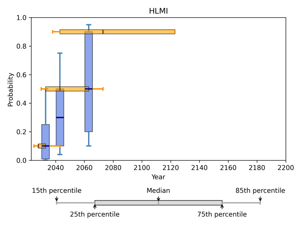
In the fixed probabilities framing, respondents were asked for the number of years until a 10%, 50%, and 90% probability of HLMI:
| Probability of HLMI | Mean response | 15th percentile response | Median response | 85th percentile response |
| 10% | 41.2 | 2 | 5 | 20 |
| 50% | 1310 | 7 | 20 | 50 |
| 90% | 4.57e+05 | 15 | 50 | 100 |
In the fixed years framing, respondents were asked for the probability of HLMI within 10, 20, and 40 years:
| Years until HLMI | Mean response | 15th percentile response | Median response | 85th percentile response |
| 10 | 18.3% | 0% | 10% | 50% |
| 20 | 34.7% | 4% | 30% | 75% |
| 40 | 54.6% | 10% | 50% | 95% |
Aggregation
Possible methods
All previous analyses produced the aggregate distribution by taking the average of CDF values, that is, by taking the mean of probability values at each year.
There are many other possible aggregation methods. We can put these into two categories:
- vertical methods like the above aggregate probability values at each year
- horizontal methods aggregate year values at each probability
This figure illustrates both methods on a very simple example with two CDFs to aggregate.
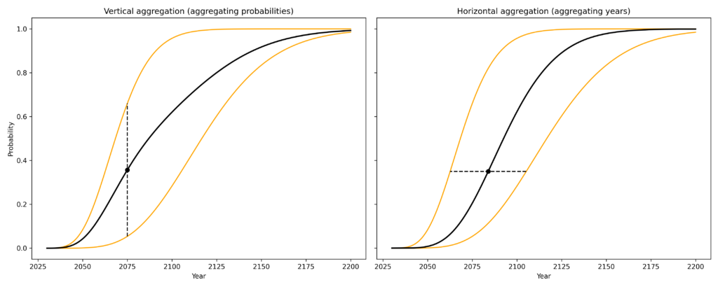
For both vertical and horizontal aggregation, we need not take the mean of values. In principle any aggregation function could be used, of which the mean and median are only the two most obvious examples.
When it comes to aggregating probabilities (vertical aggregation), there are additional complications. The topic has been well studied, and many aggregation methods have been proposed.
A full assessment of the topic would take us far beyond the scope of this report, so I will only briefly mention one prominent recommendation: taking the geometric mean of odds. The core observation is that the arithmetic mean of probabilities ignores information from extreme predictions. This can be seen with a simple example. In scenario A, we aggregate the two predictions (1%, 10%), whereas in scenario B the two predictions are (0.1%, 10%). The arithmetic mean of probabilities is close to 5% in both cases (5.5% for A and 5.05% for B). It gives very little weight to the difference between 1% and 0.1%, which is after all a factor of 10. The geometric mean of odds reacts much more strongly to this much more extreme prediction, being about 3.2% in scenario A, and 1.0% in scenario B.
This behaviour of the geometric mean of odds is theoretically appealing, but it is only advisable if extreme predictions are really to be taken at face value. We might worry that these predictions are much more overconfident.
As a further complication, in the case of ESPAI, in practise we cannot apply the geometric mean of odds. This is because for nearly every year (every vertical line) we might consider, many of the respondents’ fitted CDFs take values indistinguishable from 0 or 1. This causes the geometric mean of odds to immediately become 0 or 1.5
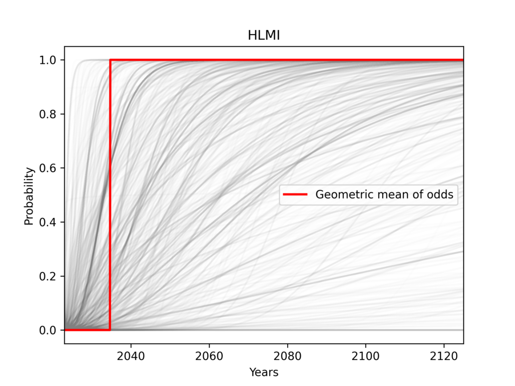
Aggregating years is also problematic. Because the input is bounded on the left but not the right, the arithmetic mean of responses is inevitably dominated by extremely large values. This method would produce a CDF where any probability of the event is essentially infinitely many years away. We might hope to address this problem by using the geometric mean of years, but this in turn suffers from numerical and conceptual issues similar to those of the geometric mean of odds. Ultimately, taking the median of years is the only method of aggregating years I was able to apply.
The median of years and median of probabilities give the same answer. This makes intuitive sense since CDFs are strictly increasing.6 So I simply call this the “median”.
Mean vs Median aggregation
As a result of these difficulties, I will present only the following aggregation methods:
- (Arithmetic) mean of probabilities
- Median of probabilities
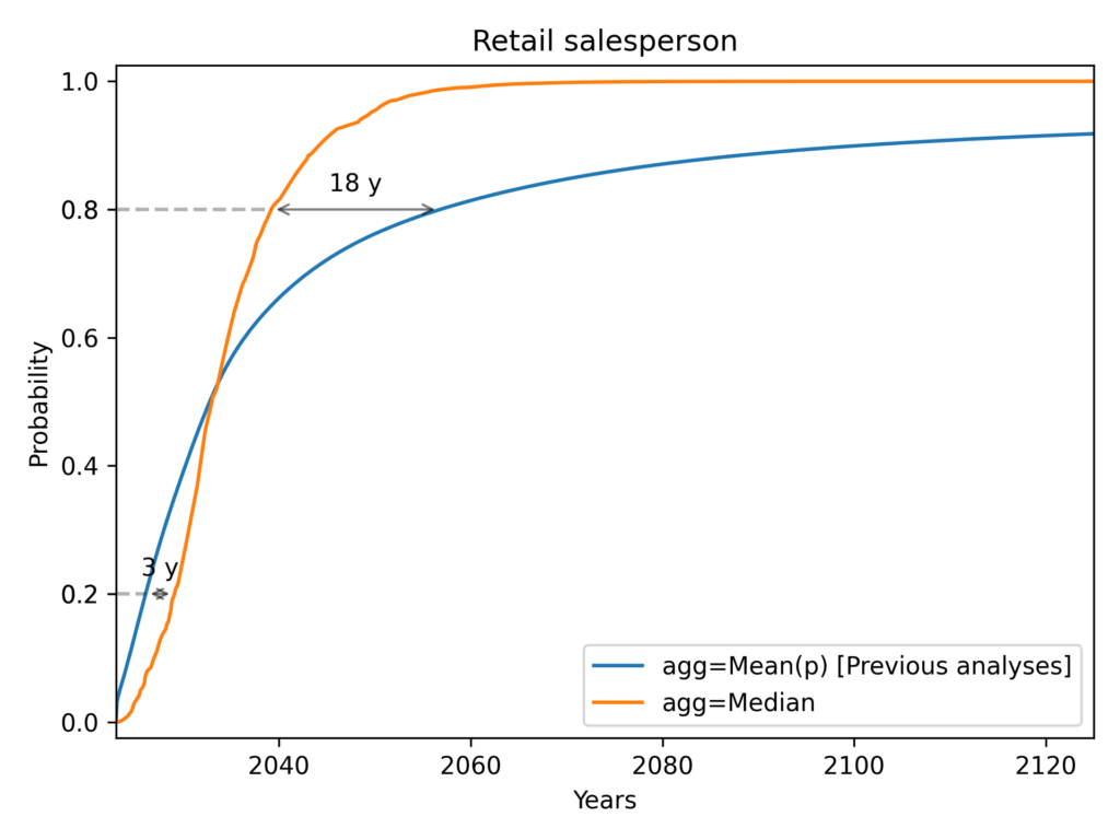
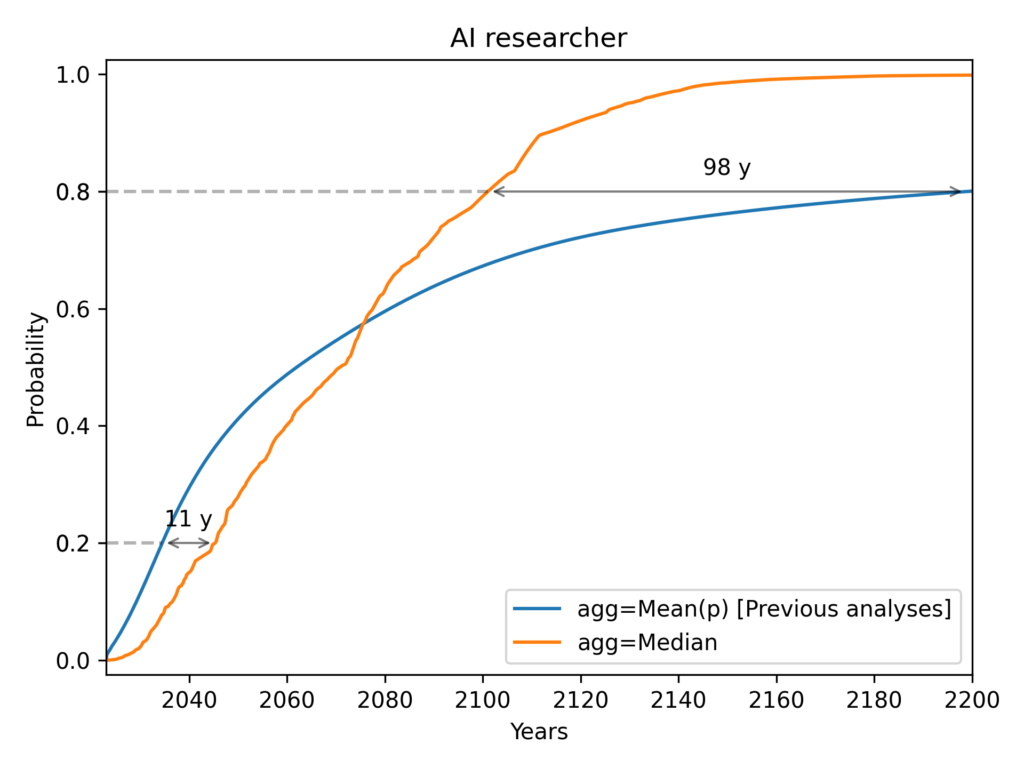
These plots use the Gamma distribution with the mean square error (MSE) of probabilities as the loss function, so the mean aggregation line corresponds to the results of previous analyses.
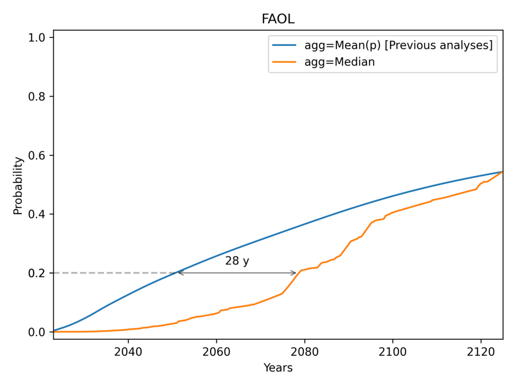
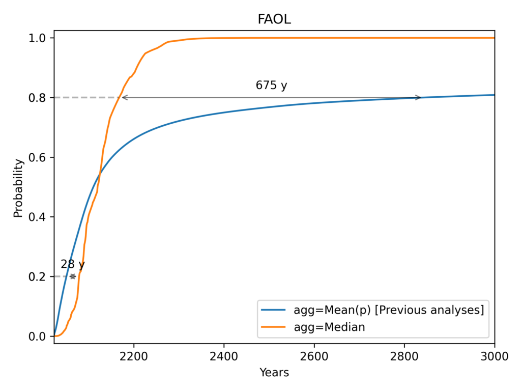
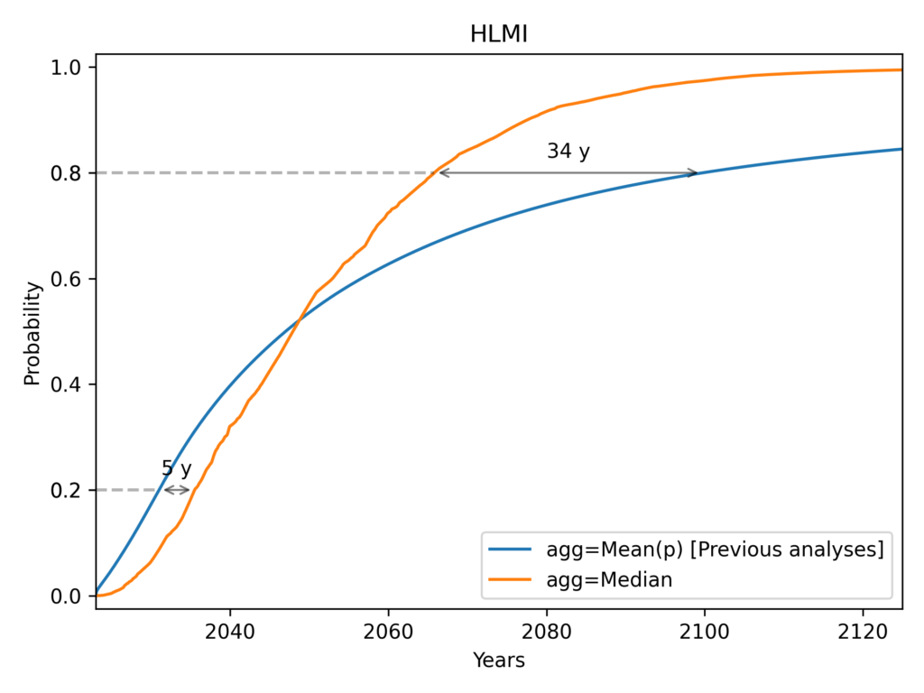
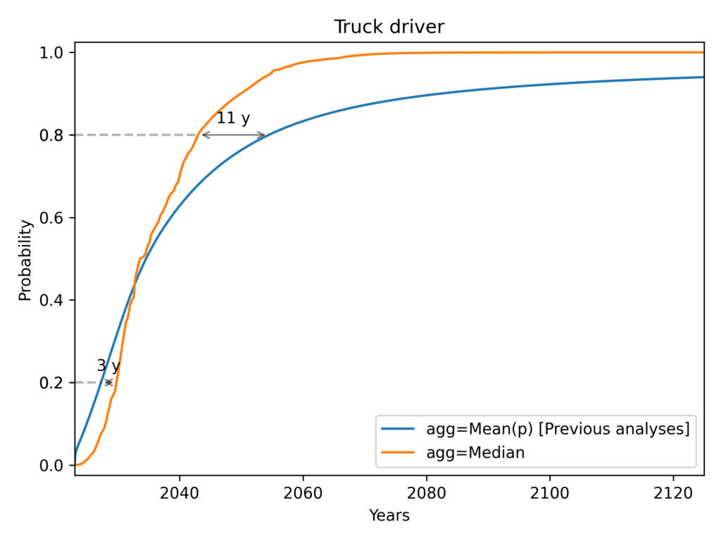
We see a notable pattern in each of these cases. As we go from left to right, the median always starts below the mean (i.e. the median initially gives later predictions), but eventually overtakes the mean (i.e. the median eventually gives earlier predictions). Median aggregation also always gives rise to a more confident probability distribution: one whose probability mass is more concentrated.
Why the mean and median differ
When the mean is very different from the median, this means that the distribution of responses is highly skewed. We can illustrate this by displaying a histogram of CDF values for a given year.
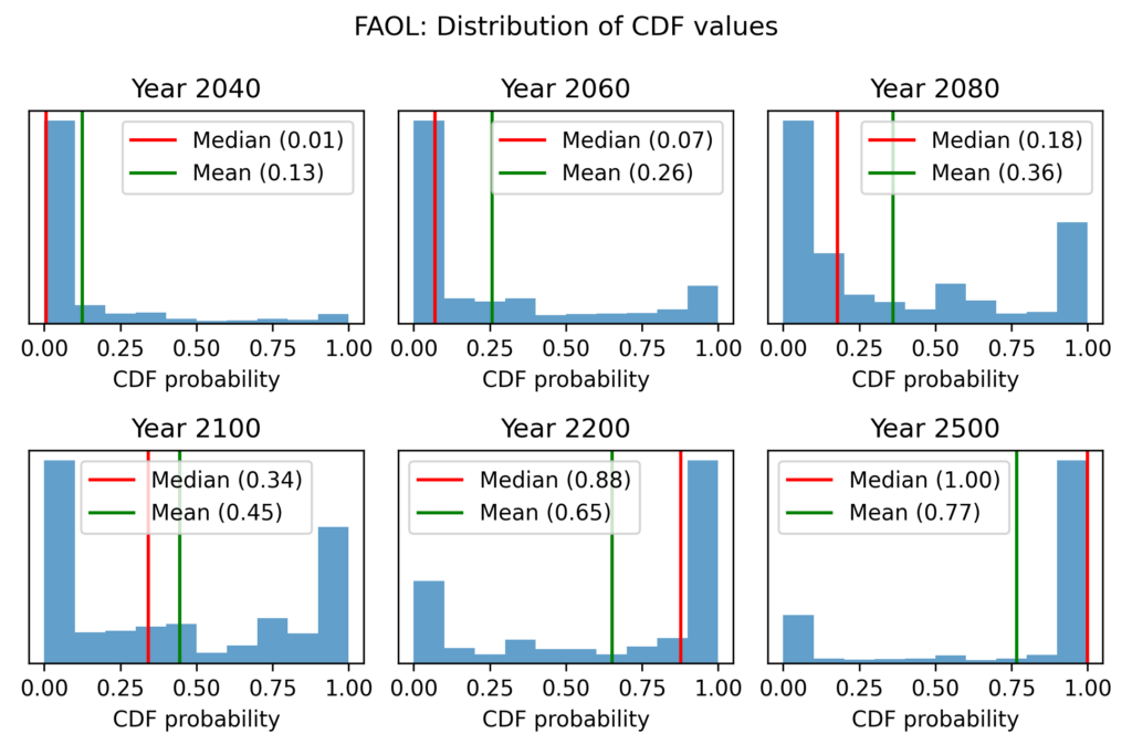
The results for automation of all occupations (FAOL) are quite interesting. For the years 2040 and 2060, the results are extremely skewed. A large majority assigns very low probabilities, but there is a right tail of high probabilities, which causes the mean to greatly exceed the median. For the years 2080 and 2100, a bimodal distribution emerges. We have a big cluster with probabilities near zero and a big cluster with probabilities near 1. Opinion is extremely polarised. By 2200 the median exceeds the mean. When we reach 2500, a majority think FAOL is near-certain, but a significant left tail causes the mean to lag far behind the median.
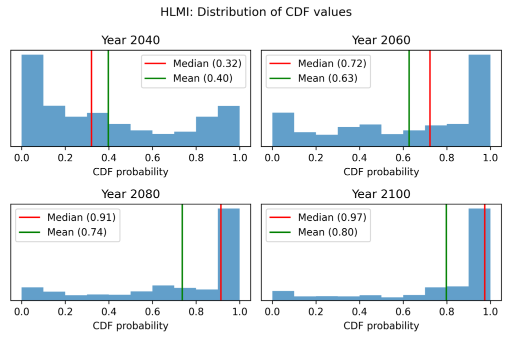
With task automation (HLMI), we see the same basic pattern (repeated everywhere): the median at first trails behind the mean, and for later years and higher probabilities, the median overtakes the mean. However, skewness is less extreme than for FAOL, and we do not see a strongly bimodal histogram (extreme polarisation) at any point.
Aside: the winsorized geometric mean of odds
There is one way to use the geometric mean of odds that avoids the problem of zeroes and ones. This is to winsorize the data: to replace the most extreme values with less extreme values. For example, we could replace all values less than 0.1 with 0.1, and all values greater than 0.9 with 0.9.
Of course, this introduces a highly subjective choice that massively affects the results. We could replace all values less than 0.01 with 0.01, or all values less than 0.001 with 0.001. Therefore, I do not consider this technique suitable for the creation of headline result.
However, it lets us do some potentially interesting explorations. Winsorising essentially means we do not trust the most extreme predictions. We can now explore what the geometric mean of odds would look like under various degrees of winsorisation. e.g. what does it look like if we ignore all predictions more extreme than 1:100? What about 1:1000?
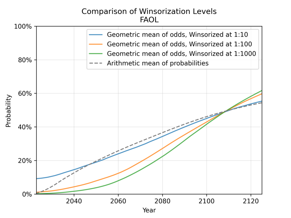
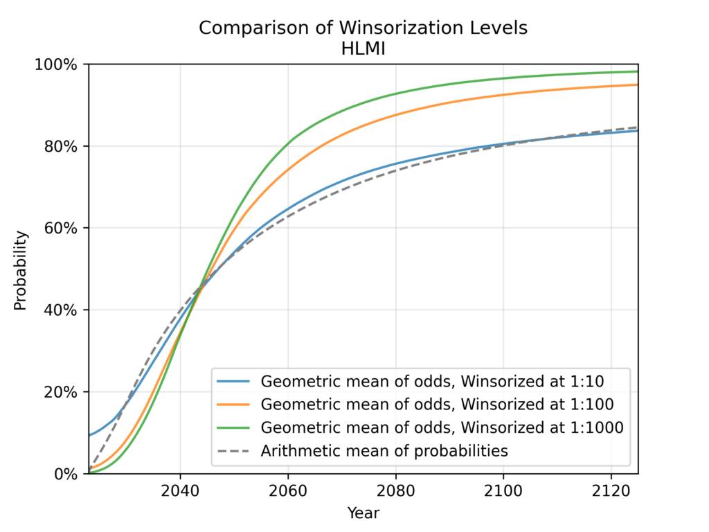
Very informally, we can see that for HLMI (tasks) and FAOL (occupations), the arithmetic mean of probabilities roughly corresponds to the geometric mean of odds with a winsorisation level of about 1:10. We’ve already discussed the well-known effect that the arithmetic mean of probabilities ignores more extreme predictions, compared to the geometric mean of odds. For this particular data, we can roughly quantify this effect, and see that it is equivalent to ignoring all predictions <10% and >90%. I find this to be quite an extreme level of winsorisation. Consider, for example, that the fixed-probabilities framing explicitly asked for predictions at the 10% and 90% levels – it would be odd to simultaneously consider these probabilities too extreme to be trusted.
Distribution fitting
All previous analyses of the ESPAI data fitted each respondent’s CDF data (triples of (year, probability)) to a Gamma distribution before aggregating these distributions.
Why fit a distribution?
Creating a full continuous distribution from three CDF points necessarily imposes some assumptions that were not present in the data. And recall, the respondents just gave numbers in text fields, and never saw the distribution that was later fitted to their CDF data.
So to begin with, it’s worth asking: why fit a distribution at all?
If we are only looking at a particular framing and question, for example FAOL with fixed years, it may indeed be preferable to look directly at the raw data. This allows us to talk strictly about what respondents said, without any additional assumptions. Even in this restricted setting, however, we might want to be able to get predictions for other years or probabilities than those respondents were asked about; this requires a full CDF. A simple example where this is required is for making comparisons across different iterations of the ESPAI survey in the fixed-years setting. Each survey asks for predictions about a fixed number of years from the date of the survey. So the fixed-years question asks about different calendar years each time the survey is made.
A more fundamental problem for the raw data approach is that we wish to aggregate the results of different framings into a single estimate. We can only aggregate across the fixed-years and fixed-probability framings by aggregating full distributions. In addition, even within the fixed-years framing, we cannot aggregate the occupations (FAOL) and tasks (HLMI) framings, because different years were used (10, 20, and 40 years for HLMI and 10, 20, and 50 years for FAOL).
Limitations of previous analyses
Constraints of Gamma distribution
While creating a full CDF from three points inevitably imposes assumptions not present in the data, we might think that, at a minimum, it would be desirable to have this CDF pass through the three points.
Previous analyses used a Gamma distribution. The gamma distribution is a 2-parameter distribution that is able to exactly match 2 points of CDF data, but not 3 points. The gamma distribution (and any 2-parameter distribution) necessarily loses information and distorts the expert’s beliefs even for the points where we know exactly what they believe.
Here are 9 examples from the fixed-probabilities framing7. They are representative of the bottom half of fits (from the 50th to 90th percentile). Each subplot shows an example where the fitted gamma CDF (shown as a gray curve) attempts to match three points from a respondent’s data (shown as red crosses).
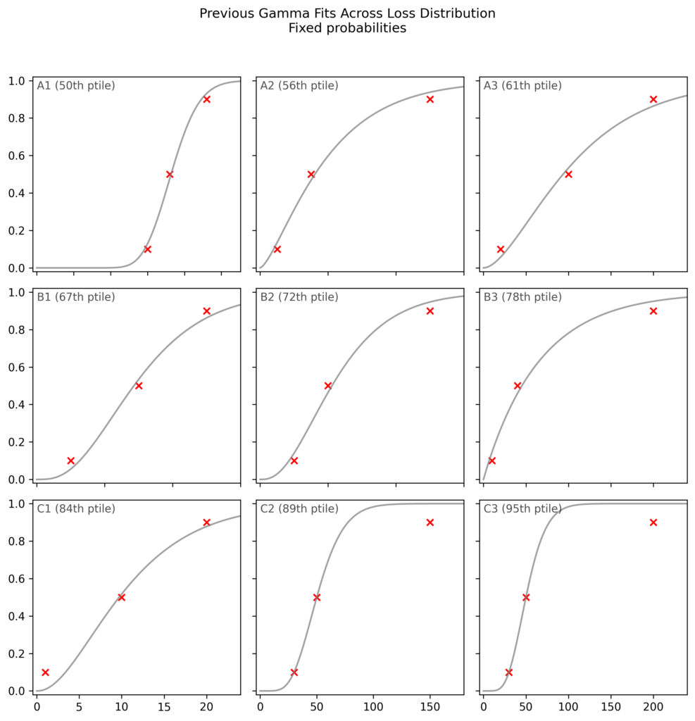
First, we can see that the gamma is not flexible enough to match the three points. While the median fit (A1) is acceptable, some fits are poor.
Inappropriate loss function
In addition, if we look carefully we can see an interesting systematic pattern in the poor fits. We can see that when the Gamma has trouble fitting the data, it prefers to fit two points well, even at the expense of a very poor fit on the third point, rather than choosing a middle ground with an acceptable fit on all three points. This begins to be visible in row B (67th to 87th percentile), and becomes blatantly clear in row C (84th to 95th percentile). In fact, in C2 and C3, the Gamma fits two points exactly and completely ignores the third. When this happens, the worst-fit point is always the 0.9 or 0.1 point, never the 0.5 point.
The errors at the 0.1 and 0.9 points can completely change the nature of the prediction. This becomes clear if we go to odds space, and express the odds ratio between the data and the gamma CDF.
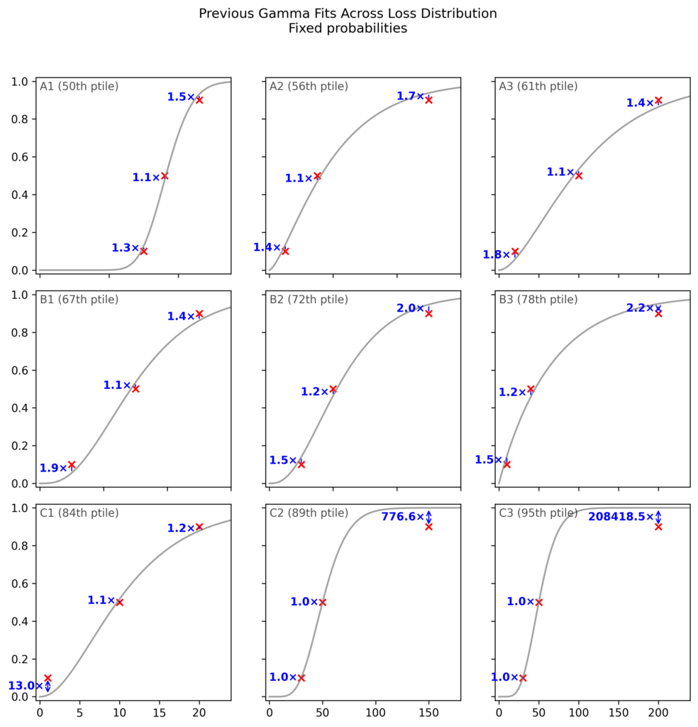
While a 2x odds ratio (e.g. in B2) is already substantial, when we move to the worst 15% of the fits, the odds ratio for the worst of the three points becomes astronomical.
The reason this happens is that the loss function used in previous work is not the appropriate one.
Previous analyses used mean squared error (MSE) of probabilities as their loss function: , where are the probabilities from the respondent’s data and are the probabilities from the fitted CDF. This loss function treats all probability differences equally, regardless of where they occur in the distribution. For instance, it considers a deviation of 0.05 to be equally bad whether it occurs at or at .
This is inappropriate when fitting CDF data. Consider the case depicted in C2, where the respondent thinks the event in question is 90% likely by 150 years from the date of the survey. Meanwhile, the Gamma CDF fitted by MSE gives a probability of 99.98% at 150 years. This dramatic departure from the respondent’s beliefs is represented in the 777x odds ratio. A 777x odds ratio at would mean changing from even odds (1:1) to odds of 777:1, or a probability of >99.8%. (A 13x odds ratio, as seen for the 0.1 point in C1 (84th percentile), would mean changing from even odds to odds of 13:1, or a probability of 93%.)
The appropriate loss function for CDF data is the log loss, also known as the cross-entropy loss: . This loss function naturally accounts for the fact that probability differences near 0 and 1 represent much larger differences in beliefs than the same probability differences near 0.5.8
As expected from this theoretical argument, we can see that the log loss, unlike the MSE of probabilities, does not display the pathological behaviour of ignoring the 0.1 or 0.9 point, and so avoids extreme odds ratios (see especially C1-C3):
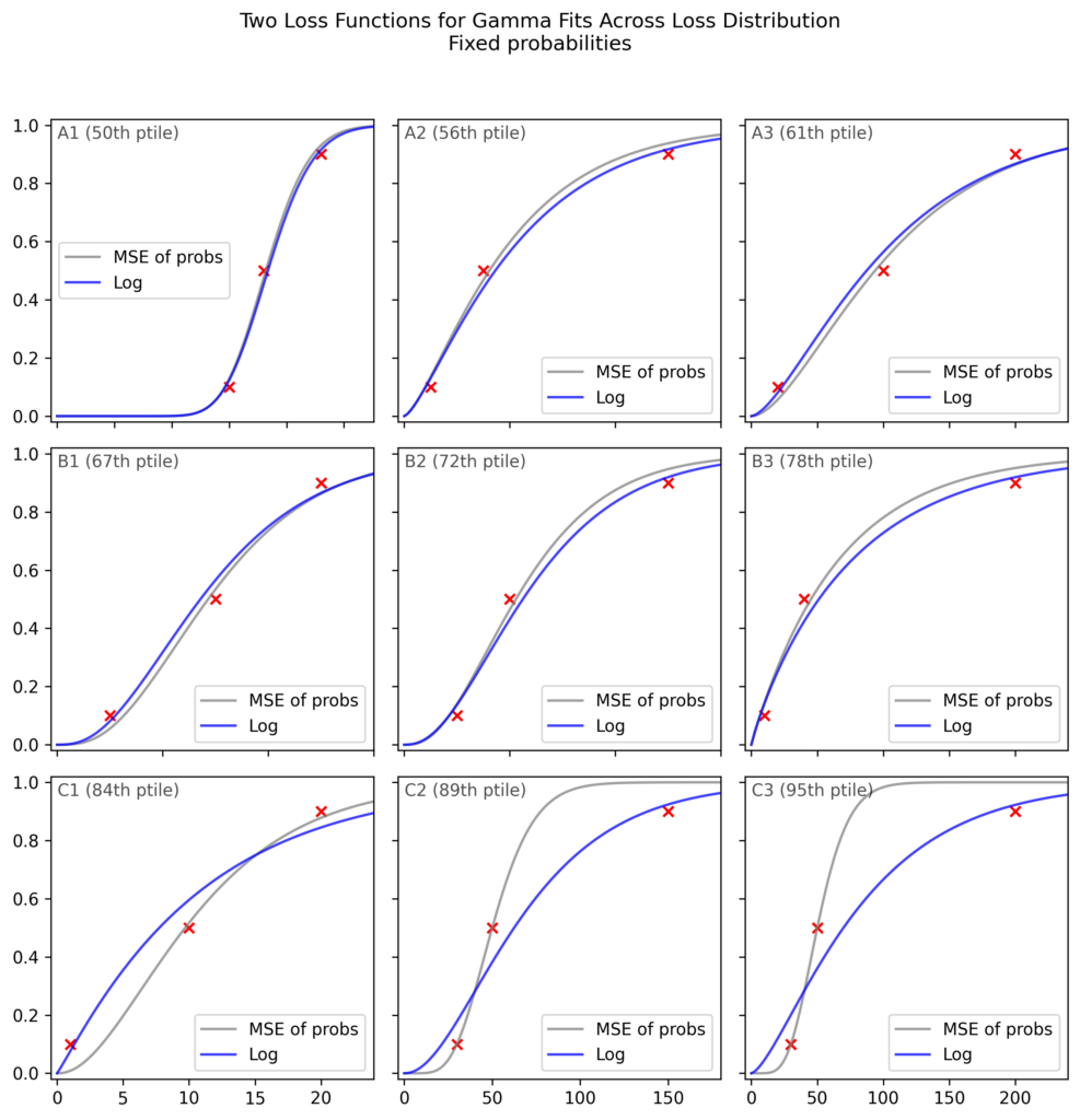
As an informal analysis, this plot suggests that the MSE leads to extremely poor fits on >15% of the data, but also that most of the MSE fits are close to the log loss fits.
When we create the aggregate CDF, we see hardly any impact of the loss function:
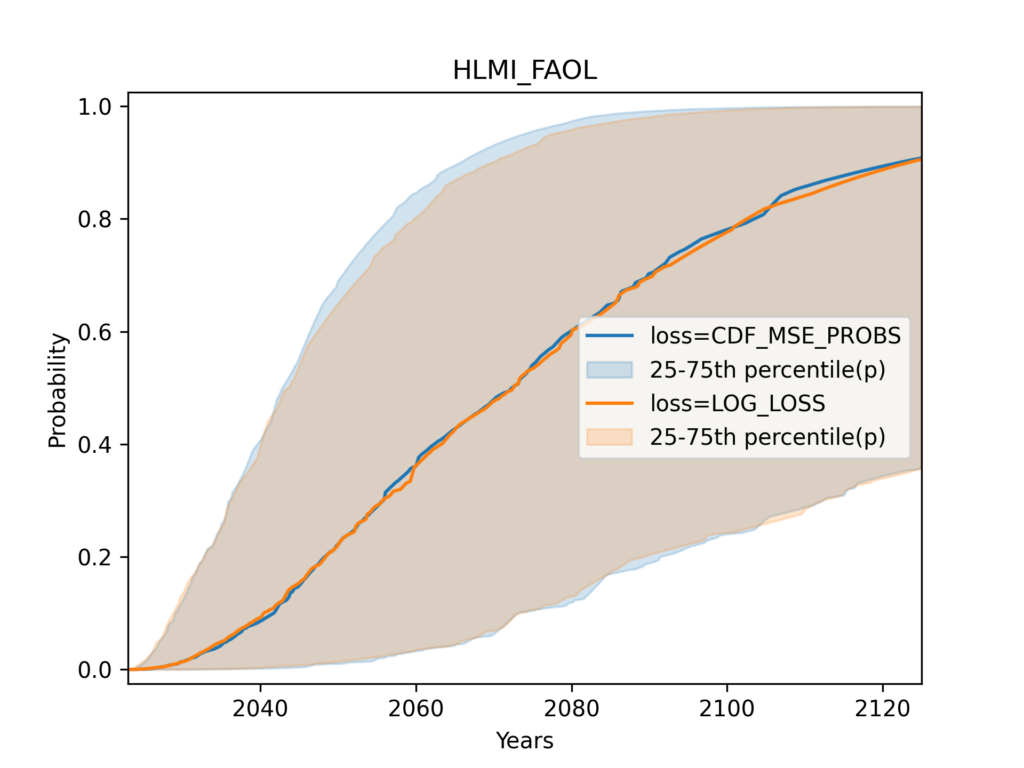
Flexible distributions
Regardless of the loss function used, we know that the Gamma distribution cannot match the three points of CDF data given by the expert9. When we use any such distribution, our results do not merely reflect the expert’s beliefs, they also reflect the mathematical constraint we imposed upon those beliefs.
Overriding expert responses in this way may be appropriate when we have a strong theoretical justification to impose a particular distribution family. For example, if we have a strong reason to believe that experts think (or ought to think) of a variable as a sum of many small independent contributions, we may wish to impose a normal distribution, even if the responses they gave us are incompatible with a normal distribution.
However, the authors of previous analyses did not justify the choice of the gamma distribution at any point. In addition, I am not aware of any strong argument to impose a particular distribution family in this case.
While creating a full CDF from three points inevitably imposes assumptions not present in the data, at a minimum, it would be desirable to have this CDF pass through the three points.
To achieve this, I used proprietary probability distributions which I call ‘flexible distributions’. I developed these over the last several years, for precisely the class of use cases faced by ESPAI. These distributions have the following properties:
- Always exactly match three CDF points (or indeed an arbitrary number of them)…
- …while taking a simple and smooth shape
- Can be unbounded, or given an upper or lower bound, or both
The distributions I used in this analysis are based on interpolation theory. While the full mathematical and algorithmic details are proprietary, you can see how these distributions behave with the free interactive the web UI at MakeDistribution (select interpolation-based families under expert settings). In addition, to make this work reproducible, the specific fitted CDFs used in the ESPAI analysis are open source10.
This plot compares Gamma distribution fits versus flexible distribution fits for fixed probabilities framing, displaying respondent points and Gamma CDFs.
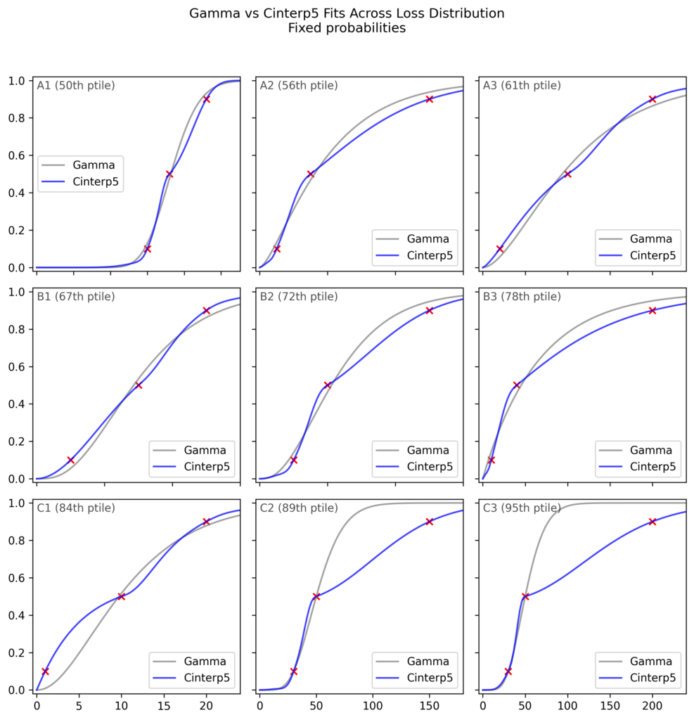
When we aggregate the individual distributions, however, we find that the choice of distribution has a very limited impact, barely any more than the impact of the loss function.
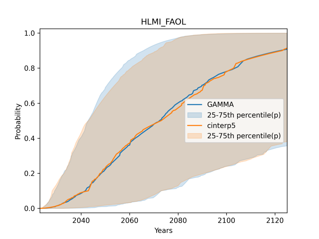
It may be somewhat surprising to see so little difference in aggregate, when we consider that there appeared to be systematic patterns in the poor gamma fits11. However, this might be explained by the fact that the majority of fits were of acceptable quality.
I ran many variations of this analysis (and so can you, using the open-source codebase). None showed a dramatic effect of the distribution family.
Other distributions
In addition to flexible distributions, I also investigated the use of alternative ‘traditional’ distributions, such as the Weibull or Generalised gamma. For each distribution family, I tried fitting them both with the MSE of probabilities loss used by previous authors, and with the log loss. These had little impact on the aggregate CDF, which might be considered unsurprising since even the flexible distribution did not have large effects on aggregate results.
Displaying the distribution of responses
What is the range of opinion12 among experts? Previous analyses gave only an informal sense of this by displaying a few dozen randomly selected CDFs:
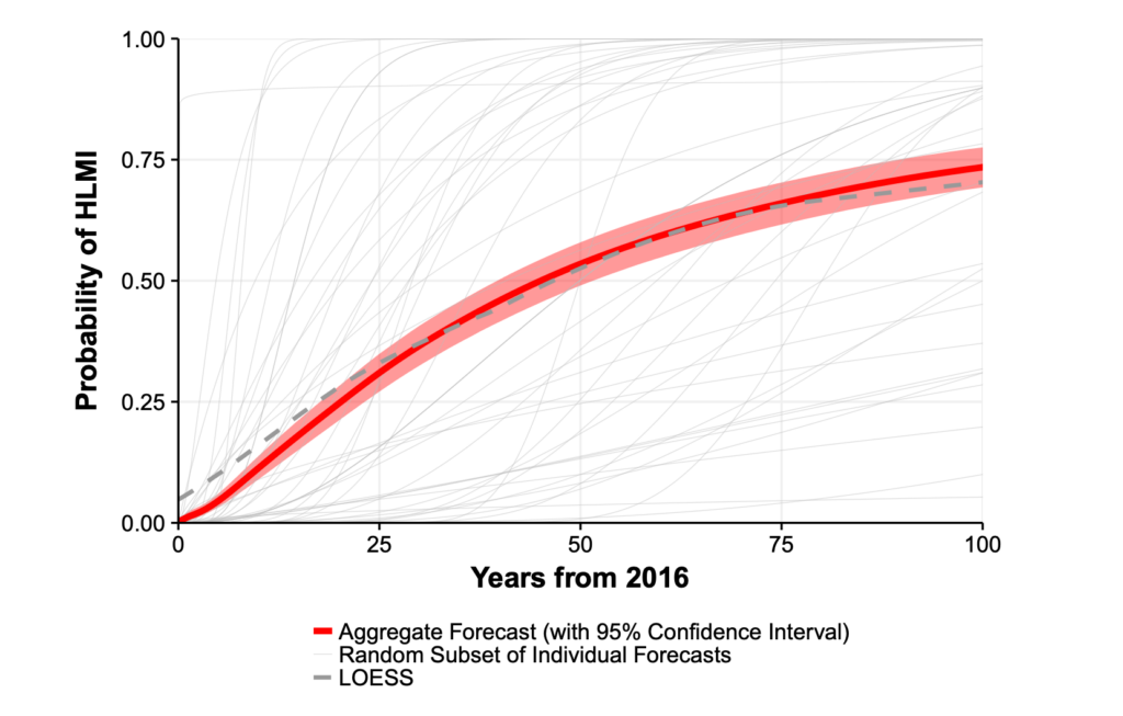
When Will AI Exceed Human Performance? Evidence from AI Experts, Figure 1.
Their plots also included a 95% bootstrap confidence interval for the mean CDF. This is a measure of statistical variability in the estimate of the mean due to the finite sample size, not a measure of the dispersion of responses. Since ESPAI sample sizes are quite large, and the mean hence quite precisely estimated, I believe this bootstrap confidence interval is of secondary importance.
I dispense with the bootstrap CI and instead use the shaded area around the aggregate CDF to show the distribution of responses, specifically the central half of CDFs, from the 25th to the 75th percentile. This is a more systematic and quantitative alternative to displaying a random subset of individual CDFs.
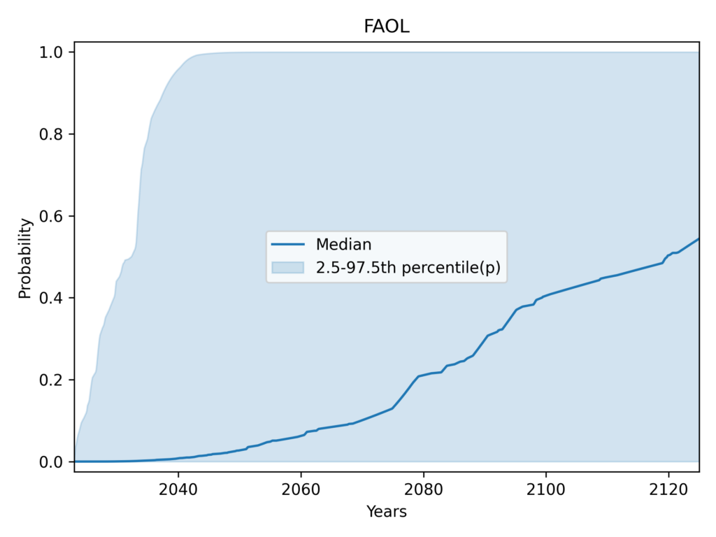
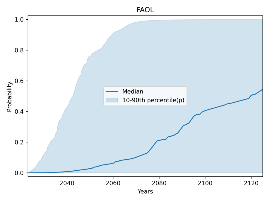
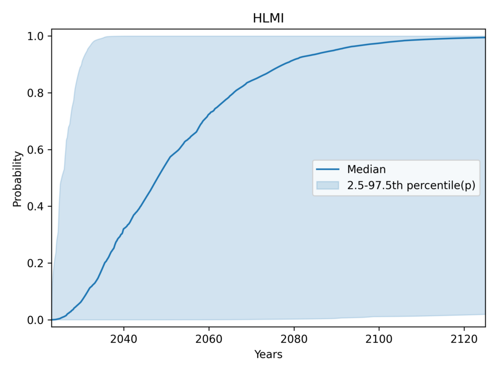
It is clear that authors of previous ESPAI analyses are well aware of what the bootstrap CI measures and interpret it correctly. However, it’s possible that some casual readers did not become fully aware of this. For the avoidance of doubt, the 95% bootstrap CI is radically different (and radically more narrow) than the interval containing 95% of individual CDFs. The latter would cover almost the entire plot:

The degree of disagreement among respondents is such that instead of 95%, I show the central 50% in my plots. This is the widest interval that I found sufficiently visually informative. More typical intervals like the central 80% or 70% would cover such a wide range of predictions as to be less informative.
Aggregating across the task and occupation framings
Before being asked for their forecasts, respondents were shown the following definitions for HLMI (High-Level Machine Intelligence) and FAOL (Full Automation of Labor):
HLMI (tasks):
High-level machine intelligence (HLMI) is achieved when unaided machines can accomplish every task better and more cheaply than human workers. Ignore aspects of tasks for which being a human is intrinsically advantageous, e.g., being accepted as a jury member. Think feasibility, not adoption.
FAOL (occupations):
Say an occupation becomes fully automatable when unaided machines can accomplish it better and more cheaply than human workers. Ignore aspects of occupations for which being a human is intrinsically advantageous, e.g., being accepted as a jury member. Think feasibility, not adoption. Say we have reached ‘full automation of labor’ when all occupations are fully automatable. That is, when for any occupation, machines could be built to carry out the task better and more cheaply than human workers.
The two questions are very similar. The main difference is that HLMI is phrased in terms of tasks, while FAOL asks about occupations. In principle, we should expect the same prediction on both questions. As noted by the authors,
since occupations might naturally be understood either as complex tasks, composed of tasks, or closely connected with one of these, achieving HLMI seems to either imply having already achieved FAOL, or suggest being close.
So it is legitimate to think of these as two different framings of the same question.
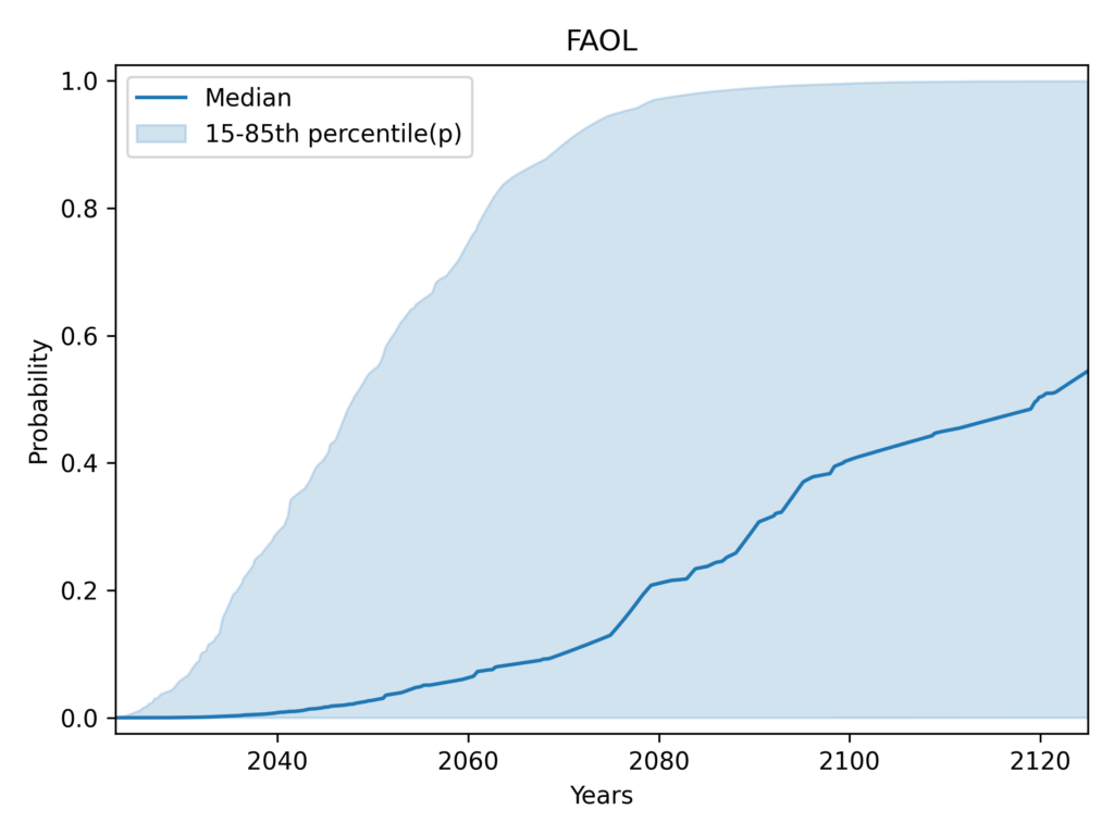
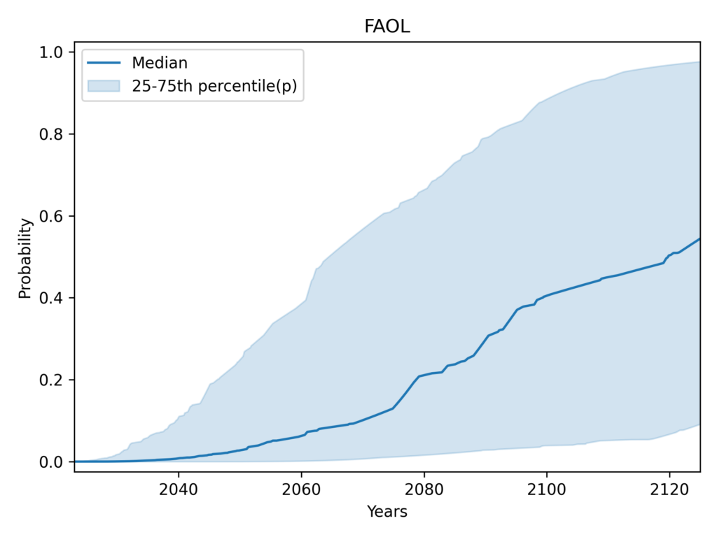
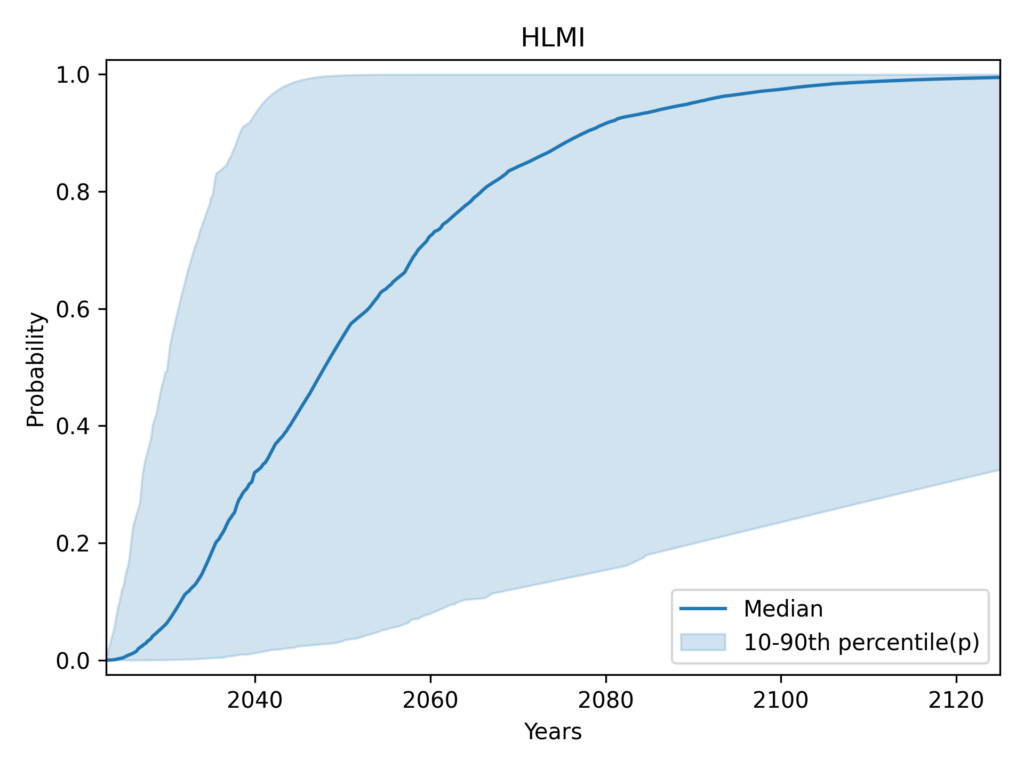
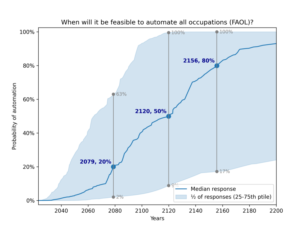
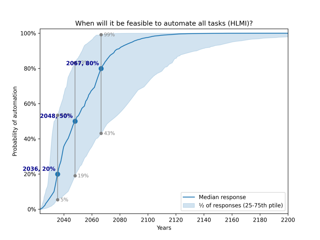
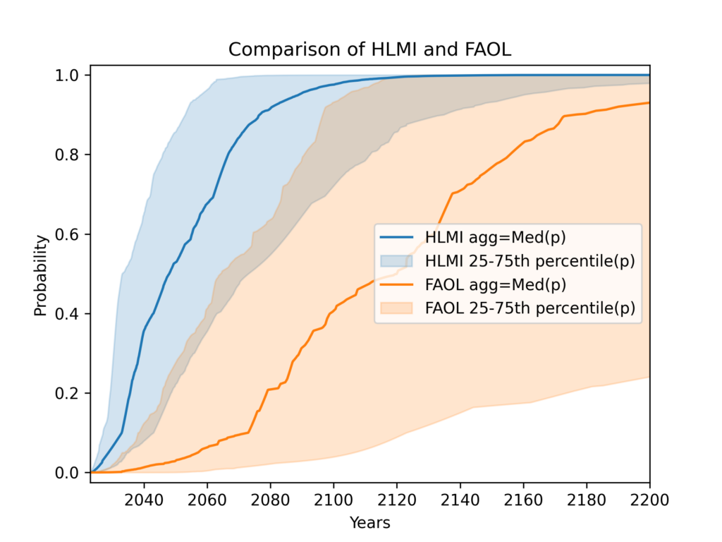
Despite their similarity, these framings yield very different predictions. The figures below show the result of using my preferred settings (median aggregation, flexible distributions), except that HLMI and FAOL are shown separately instead of aggregated:
HLMI vs FAOL
Previous analyses never aggregated the task and occupation results, only presenting them separately. Recall that using their methodology13, the authors reported the median year for all human tasks was 2047, while for occupations it was 2116 (a difference of 69 years!).
Presenting results separately allows for a deeper understanding for patient and sophisticated readers. However, we must be realistic: it is very likely that a single “headline” result will be most widely spread and remembered. Attempting to prevent this by only presenting HLMI (tasks) and FAOL (occupations) separately is largely futile, in my opinion. While it may sometimes encourage nuance, more often it will make it easier for readers to choose whichever of the two results best fits their preconceptions.
Indeed, my brief investigation suggests that citations of the 2023 survey results are strongly biased towards tasks (HLMI) over occupations (FAOL). Out of the 20 articles14 on the first two pages of Google Scholar citations of the 2024 preprint, 7 reported at least one of HLMI or FAOL. Among these
- 6 out of 7 (85%) reported tasks (HLMI) only
- 1 out of 7 (15%) reported tasks and occupations
- None (0%) reported occupations (FAOL) only
Therefore, I consider it preferable, when providing headline results, to aggregate accross HLMI and FAOL to provide a single estimate of when all tasks or occupations will be automatable.
I achieve this by simply including answers to both questions prior to aggregation, i.e. no special form of aggregation is used for aggregating tasks (HLMI) and occupations (FAOL). Since more respondents were asked about tasks than occupations, I achieve equal weight by resampling from the occupations (FAOL) responses.
Codebase
For this analysis, I wrote a fully new codebase. This was necessary because the system used for previous analyses relied on a collection of Jupyter notebooks that required manually running cells in a specific, undocumented order to achieve results.
This new codebase, written in Python, makes our analyses reproducible for the first time. The codebase includes a robust test suite.
We are open sourcing the codebase, and invite scrutiny and contributions from other researchers. It provides user-friendly configuration objects that we hope will make it easy for you to run your own variations of the analysis and produce your own plots.
Footnotes
- Timing will be my sole focus. I ignore ESPAI’s questions about whether the overall impact of AI will be positive or negative, the preferred rate of progress, etc. ↩︎
- This uses plain language as much as possible. Depending on your audience, you may wish to replace “central half” with “interquartile range”, or use phrases like “75th percentile”. Also, you can round 2048 to 2050 and 2103 to 2100 without losing anything of value. ↩︎
- Note that the ‘whiskers’ of our box plot are slightly nonstandard: they show the 15th and 85th percentile responses. Whiskers are more commonly used to represent the 1.5 IQR value: from above the upper quartile (75th percentile), a distance of 1.5 times the interquartile range (IQR) is measured out and a whisker is drawn up to the largest observed data point from the dataset that falls within this distance. ↩︎
- As a further subtlety, “the question sets do differ beyond definitions: only the HLMI questions are preceded by the instruction to “assume that human scientific activity continues without major negative disruption,” and the FAOL block asks a sequence of questions about the automation of specific occupations before asking about full automation of labor” (Thousands of AI Authors on the Future of AI) ↩︎
- In reality there are even more complications that I elide in the main text. If a set of probabilities contains both values of exactly 1, and values of exactly 0, the geometric mean of odds is undefined. If a one is present and there are no zeroes, the aggregate is one; and a zero is present and there are no ones, the aggregate is zero. However, floating point numbers by design have much more precision near zero than near one. For example, we can represent extremely small numbers like
1e-18, but1 - 1e-18just gets represented as1.0. This means that very high probabilities get represented as 1 when equally extreme low probabilities do not get represented as zero. As a result, high probabilities get an “unfair advantage”. It should be possible to circumvent some of these problems by using alternative representations of the probabilities. However, many respondents directly give probabilities of 0% or 100% (as opposed to their fitted CDFs merely reaching these values). This poses a more fundamental problem for the geometric mean of odds. ↩︎ - I believe this is probably a theorem (with the possible exception of some degenerate cases), but I am not entirely sure since I have not attempted to actually write down or locate a proof. If you’ve got a proof or counter-example please contact me. ↩︎
- I give examples only for the fixed-probabilities framing in the main text because it’s easier to explain in the context of the loss functions we are using, which all use probabilities. However, we can see similar phenomena when looking at the fixed-years data. These are 9 plots representative of the bottom half of fixed-years Gamma fits.
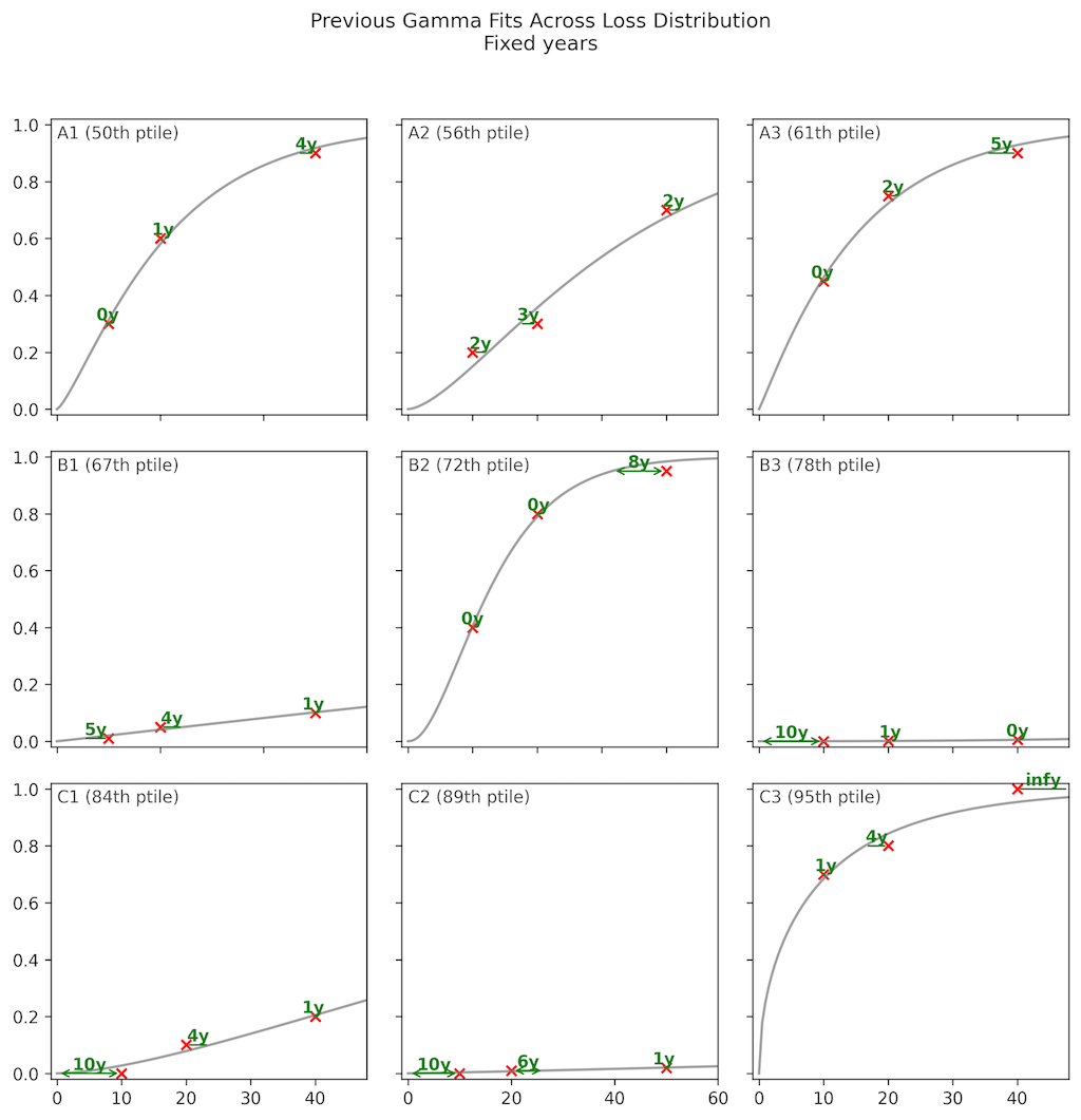
Since I am in this section aiming for expository clarity rather than the greatest rigour, I also elided the following complication in the main text. All distributions shown are Gammas fitted by previous authors, using the MSE of probabilities as the loss function. However, to produce the ranking of fits used to select which examples to plot, I used a different loss function. This was the MSE of years (horizontal direction) for the fixed-years plot, and the log loss for the fixed-probabilities plot. These loss functions make my examples more intuitive, while still being somewhat systematic (instead of cherry-picking examples). ↩︎ - The log loss can be motivated by analogy to the Kullback-Leibler (KL) divergence between discrete distributions. For each point in a respondent’s CDF data, we can think of it as a binary probability distribution (p, 1-p). The fitted CDF gives us another binary distribution (q, 1-q) at that point. The KL divergence between these distributions would be
DKL(p||q) = p log(p/q) + (1-p) log((1-p)/(1-q)) = p log(p) – p log(q) + (1-p) log(1-p) – (1-p) log(1-q)
The log loss -[p log(q) + (1 – p) log(1 – q)] differs from this only by dropping the terms that don’t depend on q, and thus has the same minimum. However, this is merely an intuitive motivation: we are not actually comparing two discrete distributions, but rather measuring how well our continuous CDF matches specific points. ↩︎ - Note that although the generalised gamma distribution has three parameters, as far as I can tell it does not have the flexibility to fit three arbitrary points of CDF data. I came to this conclusion by extensive empirical investigation, but I haven’t been able to locate or write a proof to conclusively establish this one way or another. Please write to me if you know the answer. By the way, I don’t know of any parametric 3-parameter distribution that has this property. I used flexible distributions for ESPAI because they are the only solution I am aware of. ↩︎
- The code uses the paid MakeDistribution API, but a copy of all API responses needed to perform the analysis is stored in the repository. ↩︎
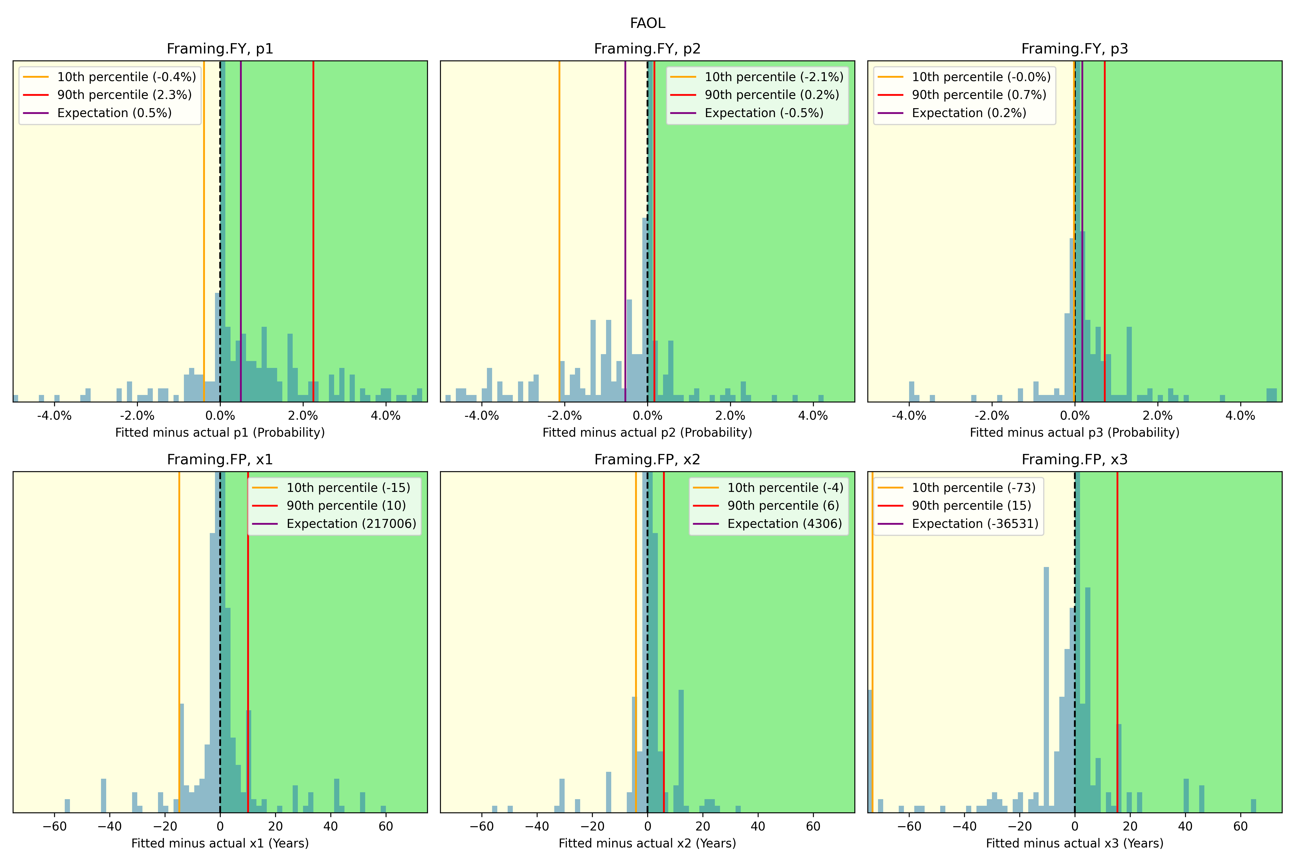
- I informally explored possible biases in the Gamma fits using the following histograms of residuals. While several of the residual distributions seem clearly biased, they also in most cases have 80% of the probability mass quite close to a residual of zero. I still do not fully understand why the effect of this data on aggregate CDFs is so muted, but I have not prioritised a more rigorous analysis.
 ↩︎
↩︎ - Due to the large framing effects of both tasks vs occupations, and fixed-years vs fixed-probabilities, which have been consistently observed, one may reasonably quarrel with describing this plot as showing “disagreement among respondents” or “the range of opinion among experts”. Part of why the range is so wide is that responses are highly sensitive to framing. Rather than saying experts disagree per se, purists might wish to say that expert opinion is undefined or unstable.
This is a rather philosophical point. The more practical version of it is to ask whether we should aggregate accross these framings, or just present them separately.
My position (further discussed here) is that while disaggregated results should also be available, aggregation is necessary to produce useful results. Aggregating things that have some commonalities and some differences is indeed inherent to science. While previous authors presented HLMI and FAOL separately, they did not present fixed-years and fixed-probabilities separately, which would be required if we take the anti-aggregation argument to its full conclusion. ↩︎ - Their methodology is different from what I used in the plots above, but yields very similar results for the median year. ↩︎
- Here is the full table: ↩︎
| Title | Year | Link | Citation |
|---|---|---|---|
| Artificial intelligence: Arguments for catastrophic risk | 2024 | Link | HLMI only |
| Safety cases for frontier AI | 2024 | Link | No numbers |
| Me, myself and AI: How gender, personality and emotions determine willingness to use Strong AI for self-improvement | 2024 | Link | HLMI only |
| Theory Is All You Need: AI, Human Cognition, and Causal Reasoning | 2024 | Link | No numbers |
| Shared Awareness Across Domain‐Specific Artificial Intelligence | 2024 | Link | No numbers |
| Existential risk from transformative AI: an economic perspective | 2024 | Link | HLMI only |
| Theory is all you need: AI, human cognition, and decision making | 2024 | Link | No numbers |
| Generative artificial intelligence usage by researchers at work | 2024 | Link | No numbers |
| AI Horizon Scanning, White Paper p3395, IEEE-SA. Part I: Areas of Attention | 2024 | Link | Two tasks (build a payment processing site, fine-tune an LLM) |
| Generative AI, Ingenuity, and Law | 2024 | Link | HLMI only |
| AI Emergency Preparedness: Examining the federal government’s ability to detect and respond to AI-related national security threats | 2024 | Link | No numbers |
| Transformative AI, existential risk, and real interest rates | 2024 | Link | HLMI only |
| Misrepresented Technological Solutions in Imagined Futures: The Origins and Dangers of AI Hype in the Research Community | 2024 | Link | No numbers |
| Eliciting the Priors of Large Language Models using Iterated In-Context Learning | 2024 | Link | HLMI only |
| Strategic Insights from Simulation Gaming of AI Race Dynamics | 2024 | Link | No numbers |
| Evolutionary debunking and value alignment | 2024 | Link | No numbers |
| Robust Technology Regulation | 2024 | Link | Extinction risk only |
| Interpreting Affine Recurrence Learning in GPT-style Transformers | 2024 | Link | No numbers |
| Malicious use of AI and challenges to psychological security: Future risks | 2024 | Link | HLMI and FAOL |
| Grow Your Artificial Intelligence Competence | 2024 | Link | No numbers |
